A Piece on Plath
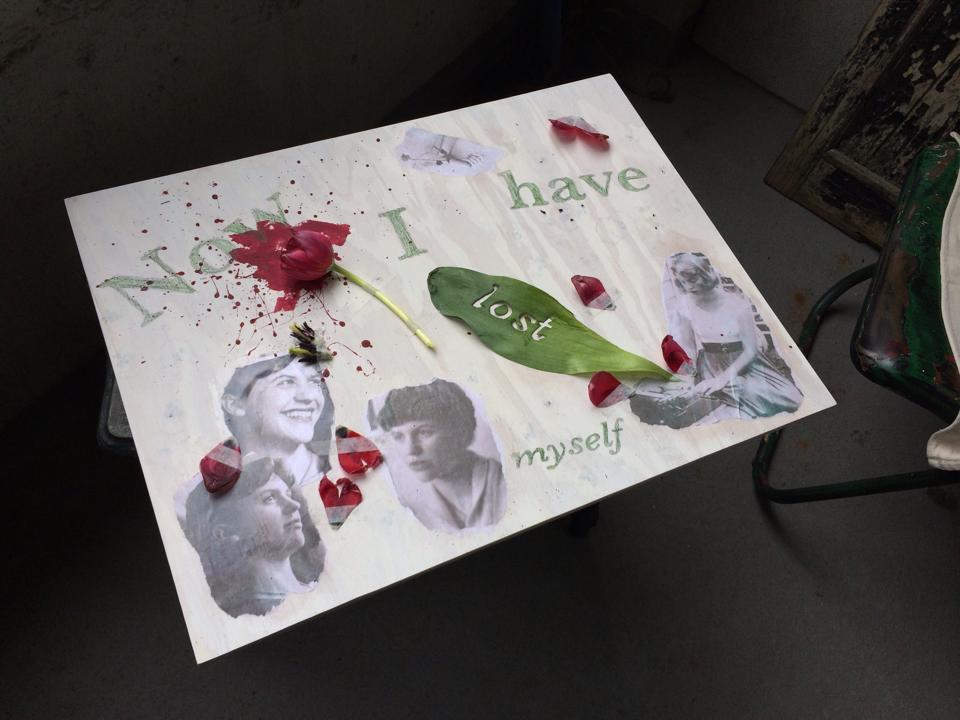 As a student of Poetry at Columbia College Chicago I was in an Introduction to Poetry course. One of the last assignments of the Spring 2014 semester was to do an “artistic translation” of a poem of our choice; as in create a piece, using any medium, based on a specific poem. For this assignment I chose to interpret Sylvia Plath’s “Tulips.” If you wish to read the poem follow this link to the Poetry Foundation website.
I had no direction for the piece other than I wanted to make some sort of collage as my translation. The first time I read the poem I noticed the great detail Plath took to record the colors. Each time after that I told myself I needed to focus on the meaning of the poem, but I just couldn’t. The color imagery was just too strong. The main color drawing my attention was white as Plath spent the most time mentioning it; from seagulls to walls to the speaker’s eyelids. Everything was white until there was a subtle black and green which was soon drowned out by red; a suffocating red. It was from there I began. Knowing nothing more than the color scheme of the poem and the coolness it created in my body; the lightness in my chest.
I bought a piece of wood; 18”x24”. Then I looked up how to whitewash wood, mixed my paint, and started. I did several coats in the middle of the night, the time I do my best work, and didn’t look at it until the next afternoon. It was a bit whiter than I had wanted, but the wood grain was still visible so I was ok with it. I wanted the wood grain to show because I wanted the viewer to be able to identify the material. My next step after that was to find, print out, and tear up pictures of Plath. I felt it was important to have photos of her because the poem felt so personal; she was a confessional poet after all. When I was satisfied with my image selections I put them in photoshop to make them softer, an easier blend with the white wood, and so the blacks weren’t so aggressive on the eye. I printed two copies of each photo so I could experiment with different ripping techniques and shapes; I wanted the edges to be fuzzy and raw like the emotion Plath put into the poem. The image I placed in the upper right quadrant of the board is of her arm holding a rose.
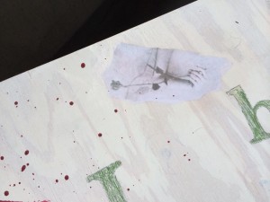
I ripped her arm off because I wanted originally to put the other half of the image, her smiling face, next to it to create an unsettling juxtaposition, but I ultimately felt like the severed appendage was stronger on its own. Once I was satisfied with the edges of the photographs I placed them on the board and decoupaged them.
The next step was to add red paint. I wanted to splatter it around, but keep the majority of the red in one area; the spot I was going to place a live tulip. I wanted the red to be bold and aggressive and I feel I achieved that. The red paint and the red of the tulips is the most saturated color of the entire piece. Once the paint was on, I began the process of attaching the live tulip along with the leaf, petals, and pistils. I knew from the moment I chose “Tulips” that I wanted to place a live tulip on a halo of red paint.
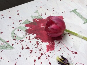
So I went out and purchased a bouquet of ten red tulips; one I had a plan for, the other nine were there for me to experiment with. I cut down the reddest tulip with the best shape and tried to secure it with wood glue. It didn’t hold very well. Then I remembered I had some white medical tape in my first aid kit. So, I used the wood glue and tape in tandem from then on. Not only did I find the medical tape aesthetically pleasing, but it was white and helped convey the location of the poem. The photograph on the lower right of the board has Plath at a typewriter and I thought it would be fun to place a leaf and several petals emanating from that spot.
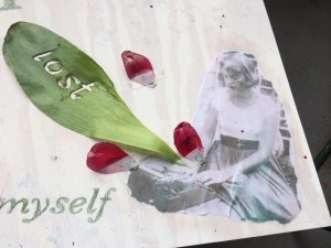
The centering of petals around her face was also meant to symbolize the suffocating nature of the red tulips as described in the latter half of the poem.
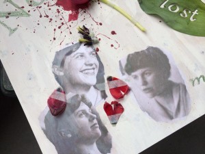 Everything else was completely random and spur of the moment. When thinking of ideas for the piece I had considered using typography in some way to relate back to my major, which is graphic design, but I had forgotten about that until I had secured the tulip. I went back and began reading the poem. The first bit that jumped out at me was “Now I have lost myself” (Plath line 17). I didn’t even use the entire line. I just felt taken with the idea of the speaker losing themselves and I thought it captured the emotions of my piece. So I typed those words into an Illustrator file at different point sizes and styles; I used the Baskerville typeface. Then I printed it out, transferred it to a sheet of tracing paper, and transferred it onto the wood and the leaf. As I was setting the type in Illustrator I thought it would be a beautiful idea to cut one of the words into the leaf; so I did. I chose “lost” because it was a short word, and therefore wouldn’t be too tedious to cut out, and also because it was near the end of the line. This was important because the leaf was going to be on the bottom right of the board and I wanted the line to read correctly from left to right. I absolutely loved the results of that.
Once I had the letters on the board and colored green I still had a lot of empty space to fill up. I had a pile of petals and the two pistils sitting near the triad of faces. As I slowly whittled down my petal pile I noticed the pistils sitting about where I ended up attaching them.
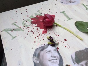
I loved how they affected Plath’s face and they just looked lovely there. After all the live parts were attached I saw that I had a large section of negative space under “have,” but I wasn’t sure how to get rid of it. I didn’t want to include another photo because I liked the arrangement I had. Then it hit me. I grabbed a pain or scissors, cut the petals off of a tulip, cut out the remaining parts of the pistils, and made that into a stamp.
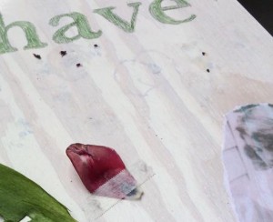
It was subtle and filled the space nicely. I liked the effect so much that I stamped the whole piece; paying special attention to the photographs. The goo from the cut tulip that was leaving the marks didn’t stick too well to the smooth, decoupaged surface of the photographs, but I attempted to stamp the marks onto Plath’s image in order to further heighten the feeling of the suffocating tulips. I stepped back to look over the piece and felt it was finished.
While I may not have gained any new insight on the poem, I felt I better grasped the emotions after doing this translation. As I was placing things I had no real idea of where I wanted to go with it, I just placed things where they felt right. The quote from the poem starts at the focal point, the red paint and head of the tulip, entirely by accident. I always work in a very loose, spur of the moment style and this project was no different. I began with a rough mental idea, but let my emotions and the emotions of the poem guide me from there.