Hike conference review
Yesterday I went to the Hike conference at Morningstar Inc. headquarters in Chicago presented by The Secret Handshake.
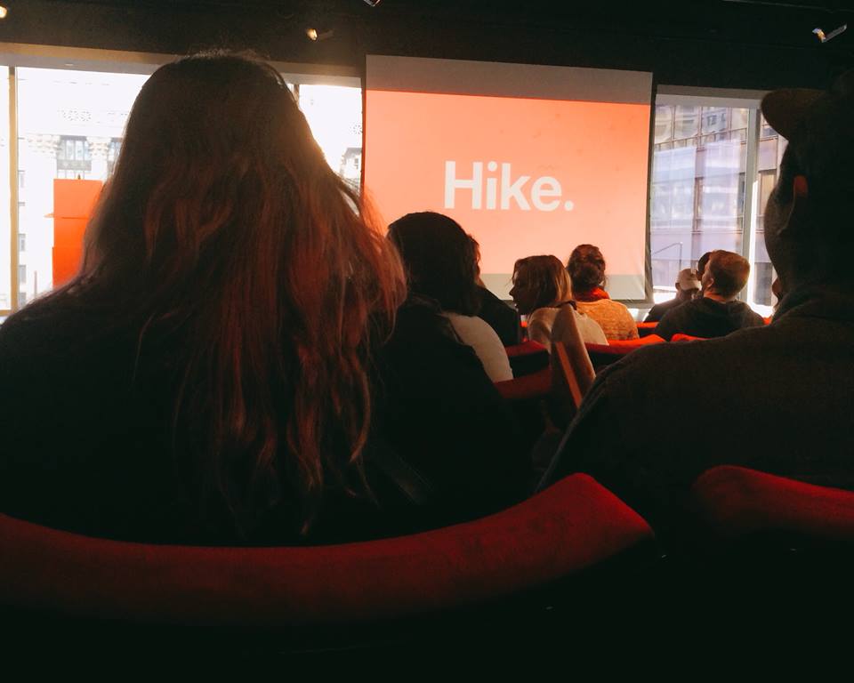
It was a day filled with presentations geared towards inspiring young designers, such as myself, hoping to break into the industry. My dad was in town and volunteered to drive me to building. It seemed very busy for 8:30 in the morning, but maybe that’s because I’m not usually out and about that early. I headed into the glass fronted building and got on the elevator with several other conference attendees. We stepped off the elevator and found ourselves at a table with name tags that we were supposed to write our favorite typeface or last read book on so it’d be easier to make conversation with other people. I didn’t fill in what my last read book was. Not because I didn’t want to mingle, but because I was overwhelmed by all the glass, tall ceilings, and morning people. The book was “The Nose” by Nikolai Gogol in case you were wondering though. I snatched my swag bag emblazoned with crisp red letters that spelled Hike and made a beeline for their roof deck; through glass doors of course. Don’t get me wrong, I loved how modern and sleek everything was, but it also happened to be very intimidating. So I stood by myself outside in the crisp, Chicago autumn air. The side of a nearby building was painted a bright yellow with thick black letters spelling out, “GO DO GOOD.” It was clearly going to be an inspirational day. Promptly at 9 o’clock, all of the us conference attendees were ushered into an auditorium that, despite being surrounded by floor to ceiling windows, felt very much like a movie theater with rows of comfy red seats that had arm rests. People were still shuffling around so I watched pigeons darting around in beams of sunlight, leaves swirl up and dance on the wind, and admired the engaged Corinthian columns adorning the building across the way. Then the conference started with an introduction and welcome by Laura Helen Winn and Jason Schwartz.
The first speaker of the morning was Alisa Wolfson of Leo Burnett. She began and ended her presentation with the same words, “Starting never ends.” It really captured the heart of what she was trying to impart on all of us in the audience; which was mostly comprised of students. There is always a new project, a new desire, for us to chase. While showing photos of her childhood and dropping tips like, “be nice,” “be brave,” “stay hungry,” and “boredom is ok” Wolfson took us through how she got started in her career.
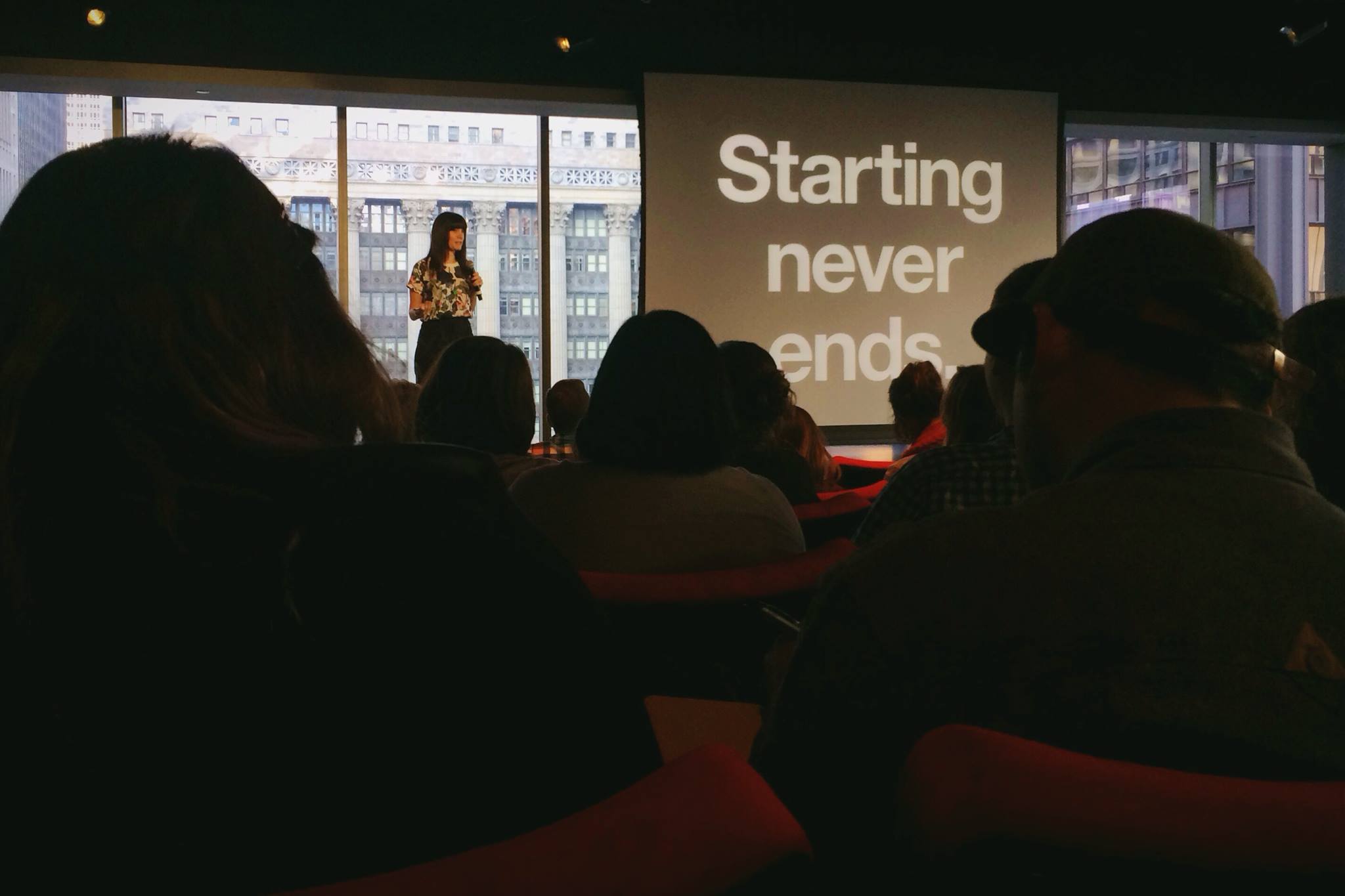 (Alisa Wolfson)
Following Wolfson’s lead, the second speaker, Alison Yard Medland of IDEO gave another touching presentation about her journey. Where Wolfson focused on her past and current jobs, Medland took the audience down the path of how she became the designer she is today. She made us laugh by poking fun at her college self; competitive, cold, and someone no one liked. Then she inspired all of us by detailing how her view on the world, and modern art, changed. Medland had met a man, who is currently her fiancé, whose creative style was vastly different from hers. While working at Discovery Channel she was driven to be the best, to “win.” This man was loose and playful in his approach to design. Medland told us how meeting this man, and a couple fortune cookies, pushed her to completely change her life, move to Chicago, and start anew. Her presentation hinged on one piece of advice, “Anyone can do anything.” It was a truly moving experience to listen to her.
The next speaker was Chuck Anderson who started No Pattern when he was just 18. He is 29 now, but still seems like a teenager; full of energy, passion, and the boldness to take huge risks. He began by showing us a slideshow of his work set to a thumping tune by The Black Lips; just in case he talked too much and didn’t get to show us his work later on. One thing that really jumped out was when Anderson said he used to go to Borders bookstores, flip through magazines looking for the names of the Art Directors, and would then try to guess their emails using every possible combination of their name and wait for one to go through. That was how he ended up doing a design for ESPN. His presentation vibrated with wisdom about learning to do invoices, taking every job that comes your way when you’re starting out, even if it’s not exactly something that excites you, and just finding yourself. He included a few quotes, like one from Charlie Parker that read, “Master the instrument, master the music, then forget all that shit and play,” but the best piece of advice was something Anderson and one of his friends in high school used to say; “If you do something, something will happen.” It’s simple and to the point, but some of the greatest pieces of wisdom are just that.
After a break and some Potbelly in the spacious cafeteria that overlooked the “GO DO GOOD” building, it was time to get back into the presentations. There were two areas, the auditorium where we all started out the day, and a glass encased room with hard chairs, where presentations would be going on simultaneously for the next three hours. The auditorium was going to be more inspirational in the same vein as the morning’s presentations, while the speakers in the glass box would be going over more practical advice about our portfolio and handling job interviews. While I wish I could have attended the presentations of Brian Innes of Twitter and Kunal Bhat of Modest, I was very pleased with my choice not to go to the auditorium.
Mike Joosse, Director of Communications at VSA Partners, started off the afternoon by discussing the dos and don’ts of social media. While my personal favorite moment was, “There’s a fuck-ton of noise of Twitter” the presentation was filled with amazing advice. Joosse showed compared the differences between a personal social media presence versus that of a company by showing us his Twitter, Instagram, Facebook, and LinkedIn accounts and those of VSA Partners. He detailed that the VSA Twitter account was on a strict posting schedule with various categories of stories that were to be posted at different times of day. His twitter was less rigid, but still simplified as compared to what the majority of people do; i.e. no live tweeting events. Joosse’s approach to Instagram is about ditching selfies and focusing purely on photography. The VSA profile on the other hand is geared toward humanizing the company and showcasing its employees through playful use of the “man crush monday” and “woman crush wednesday” trend posts. I took away many valuable strategies that led me to basically press the restart button on my Twitter and Instagram profiles.
The next speaker was Kim Knoll who is the co-founder of Knoed Creative. She was the presenter I was most excited to see as I had recently come across their work and loved it. Knoll spoke about her start in the industry and how she worked her way up through various places to now. But the main bulk of her presentation was helping is young designers figure out what to do when going for an interview and building our portfolio. Knoll, who had asked professionals at various design business their opinions, said that the most important thing employers were looking for when deciding if someone was right for their company was the designer’s portfolio. The second most important thing was one’s attitude. She showed a slide with a quote that read, “Attitude is more important than education, successes, appearance, and skill.” (I guess her quote didn’t understand the importance of a portfolio.)
I left the glass room after Kim Knoll and went to the auditorium to see Justine Lee of Frog, who was not a designer, talk about the importance of side projects. It was a fun presentation filled with technological glitches and stumbling rambles from a nervous first time presenter about a shirtless, professional cuddler. I was glad when it was over, though. The next event of the day was the “How to Get That Gig” panel with Jeff Canzona of R/GA, Maria Giudice of Facebook, Antonio Garcia of gravitytank, and freelance Senior Art Director at Leo Burnett, Lashun Tines. They answered questions about what do employers look for which echoed what I had heard from Kim Knoll. I also learned about what they referred to as an “information interview” where you simply reach out to someone at say, VSA Partners, and ask to meet them and pick their brains about what they do and the industry. It was a good discussion and they answered a few audience questions.
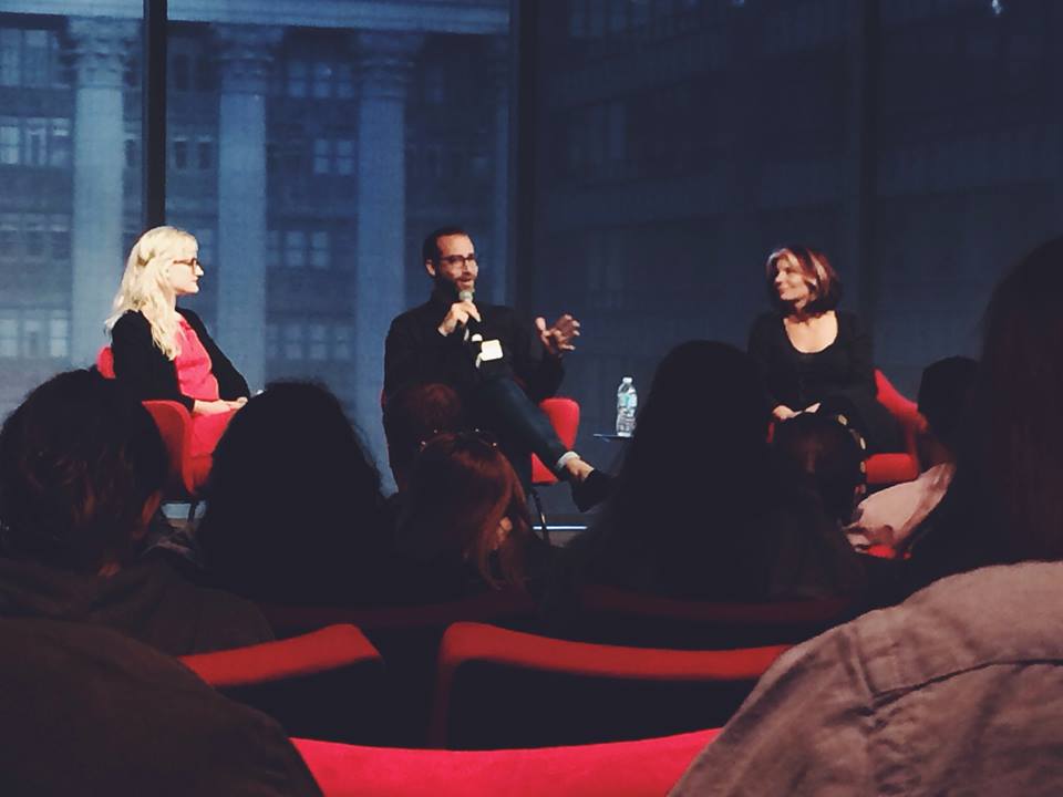 (How to Get That Gig panel; left to right: Laura Helen Winn, Jeff Canzona, and Maria Giudice)
The final presentation of the day, at around 5 o’clock, was by Jason Bacher and Brian Buirge of Good Fucking Design Advice (GFDA). They ran what was left of the conference goers, as many had left throughout the day, through their history. GFDA started small when they were in grad school. Everything about the site and the products they eventually decided to sell was done on a whim; them blindly walking into it. I learned that ideas can really take off when you believe in them and throw in a good dose of hard work. They swore their way through the presentation, and had us all laughing and throwing up middle fingers for a photo. They ended with a great bit of advice though, “Risk everything, expect nothing, and prepare for anything.”
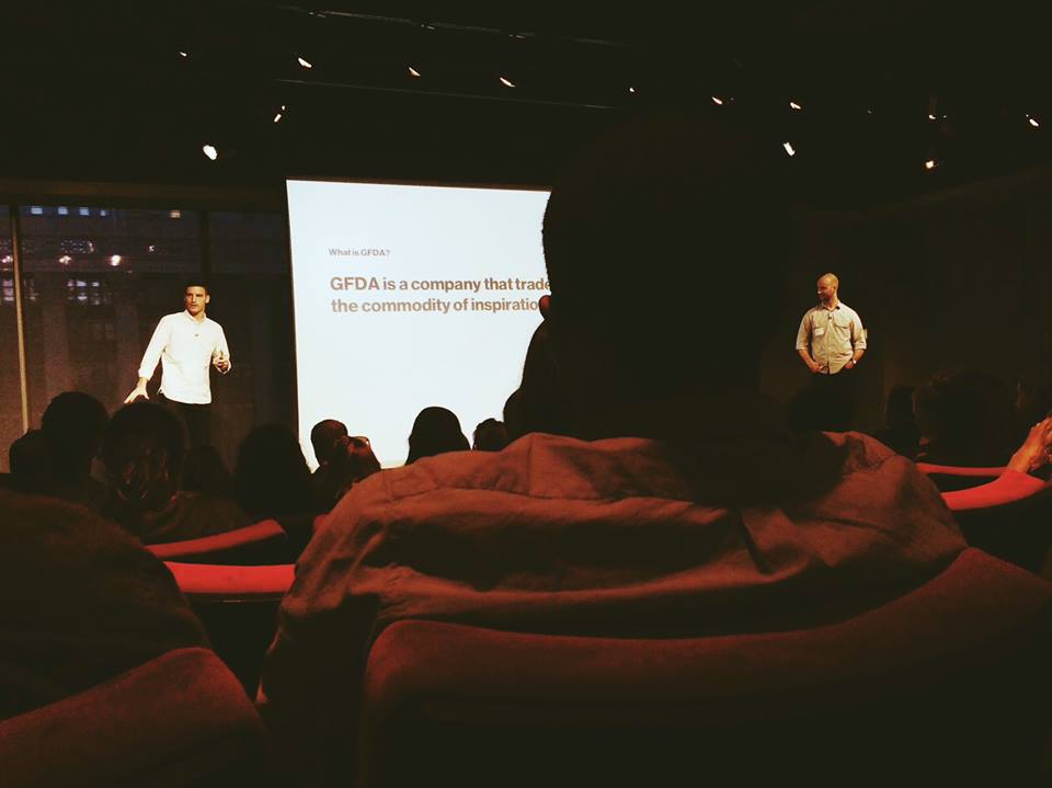 (Jason Bacher and Brian Buirge)
I learned a lot at Hike and consider it a huge step forward into my career.
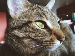 Rescue kitty Marla
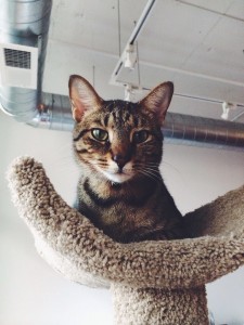 Rescue kitty Quincy


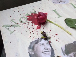
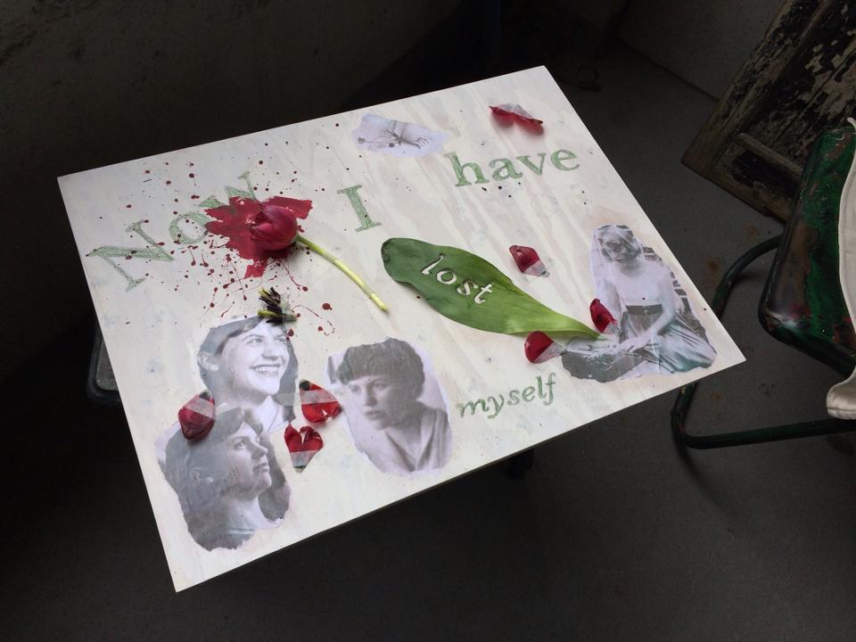 As a student of Poetry at Columbia College Chicago I was in an Introduction to Poetry course. One of the last assignments of the Spring 2014 semester was to do an “artistic translation” of a poem of our choice; as in create a piece, using any medium, based on a specific poem. For this assignment I chose to interpret Sylvia Plath’s “Tulips.” If you wish to read the poem follow this
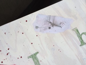
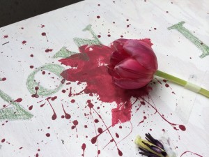
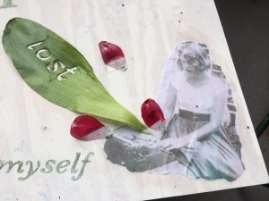
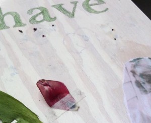
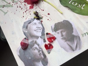 Everything else was completely random and spur of the moment. When thinking of ideas for the piece I had considered using typography in some way to relate back to my major, which is graphic design, but I had forgotten about that until I had secured the tulip. I went back and began reading the poem. The first bit that jumped out at me was “Now I have lost myself” (Plath line 17). I didn’t even use the entire line. I just felt taken with the idea of the speaker losing themselves and I thought it captured the emotions of my piece. So I typed those words into an Illustrator file at different point sizes and styles; I used the Baskerville typeface. Then I printed it out, transferred it to a sheet of tracing paper, and transferred it onto the wood and the leaf. As I was setting the type in Illustrator I thought it would be a beautiful idea to cut one of the words into the leaf; so I did. I chose “lost” because it was a short word, and therefore wouldn’t be too tedious to cut out, and also because it was near the end of the line. This was important because the leaf was going to be on the bottom right of the board and I wanted the line to read correctly from left to right. I absolutely loved the results of that.