Pantone 2016 Color of the Year
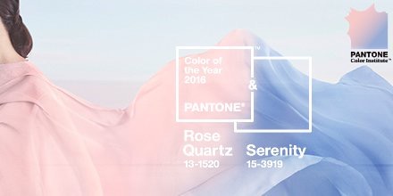
Yesterday Pantone announced not one, but two, colors of the year for 2016; Rose Quartz and Serenity.

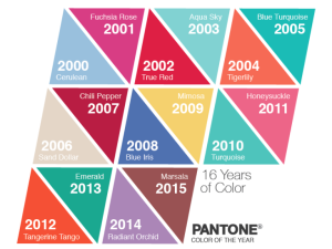
They are joining an impressive lineup of past colors.

I’ve been on a pastel kick myself lately so I’m pretty jazzed that the color trends are right where I’m at. But the other thing that has me really excited about these colors is the symbolic implications of them. Pink is naturally associated with love and romance. This connection is further heightened by its name, Rose Quartz. Rose quartz is the love stone. It brings and keeps love in one’s life, and not just romantic love. Blue is very calming and restful. Serenity is an absolutely fitting name. When these colors are side by side I can’t help but feel a sense of peace wash over me. It’s like staring up into the soft, morning sky.
Executive editor of Pantone’s Color Institute, Leatrice Eiseman, remarked on the pairing, “We wanted compassion, which today a lot of people are looking for.” And Pantone’s news release says, “Rose Quartz and Serenity demonstrate an inherent balance between a warmer embracing rose tone and the cooler tranquil blue, reflecting[…] a soothing sense of order and peace.”
With the amount of violence we’ve seen in 2015, I, for one, am looking forward to a compassionate, peaceful, and more loving 2016.