Poetry Reading
Friday, dark and chilly, I wandered up to Logan Square to attend a poetry reading by Michael Robins (my Advanced Poetry Workshop instructor), Adam Clay, and Joel Craig at Uncharted Books. I vaguely remembered the poems from Craig’s collection The White House from when I read it for Intermediate Poetry Workshop, so I was looking forward to getting reacquainted with his poems. And that Robins guy? I was definitely interested in hearing what his style was seeing as where he’s coming from as a poet is influencing where I’m going. Adam Clay was an entirely new experience for me. So into the winter night I went with my boyfriend and his white, ’77 Cadillac.
As I walked up to the bookstore where the reading was being held I saw a curious white dog in the window. It was hard not to think of that one song about the “doggie in the window” as my boyfriend finished puffing on his Lucky Strike. The smell of old books hit me before I even got my whole body in the door, and I felt happy. The creaky floors and books piled and organized on shelves with handwritten labels greeted us. We said hello with our fingertips and stood waiting for the reading to start. It was a bit after 7 o’clock when Robins finally kicked things off with “Poem White Page White Page Poem” by Muriel Rukeyser and an introduction of all the poets, including himself. Adam Clay was to read first.
Clay was a small man; though I suppose all of the poets were slender and stereotypically poet-like in that respect. The things I noticed most from his poems was the sound, the strong images, and his use of wordplay. He didn’t read too fast, but took his time. It was a pleasurable experience listening to his work, and why I later purchased his collection. Clay said before reading a pastoral poem, “if you live in Kentucky you write about horses and bourbon.” Little did I know that this wasn’t the last time horses would come up that night.
Joel Craig was up next. Tall and spectacled, he stepped up to the podium, or rather loomed over it, with a stack of papers from which to read. And so began the heaviest portion of the reading. His voice fell down on all of us in attendance as he read in a slow monotone. I remember initially thinking it was achingly slow, but came to appreciate how lovingly he treated each word and phrase as it rolled out. As Craig’s reading dragged on I looked about the space; Craig’s twitching leg, the books, the people, my boyfriend slowly inching closer to me as time passed. It was just one long block of sound as the titles of the poems got lost and mixed in with the poems themselves. I was happy when it was over. (My boyfriend later remarked that Craig’s reading was weird and sounded more like “bluh, bluh” noises than actual words.)
Last to go was Michael Robins; the main reason I came. He began by saying that he was going to read from section three of his book because he asked his daughter to choose a number, and that was her selection. He moved his body into his poems as he read, propelling his soft voice out and around us. Amidst moments of discussing his previous marriage – “belief isn’t the golden ring you wear, but the way you wear it” – there were horses. Then he read “Only Sunshine,” his poem about the Sandy Hook shooting. The way he slowed that poem down and repeated “one” over and over brought an oppressiveness to the space that really mirrored the subject matter. I felt a heaviness in my chest just below my ribcage as the words hit me. Relief came in the form of a new poem almost entirely driven by sound, rather than the words attached to it.
Overall, the reading was a good experience. I was introduced to work by a new to me poet, I gained a new insight into a poet I’ve read previously, and I got to hear some of my instructor’s work. I also left with work by Adam Clay and Michael Robins.
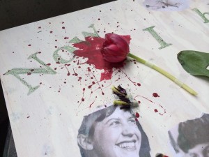
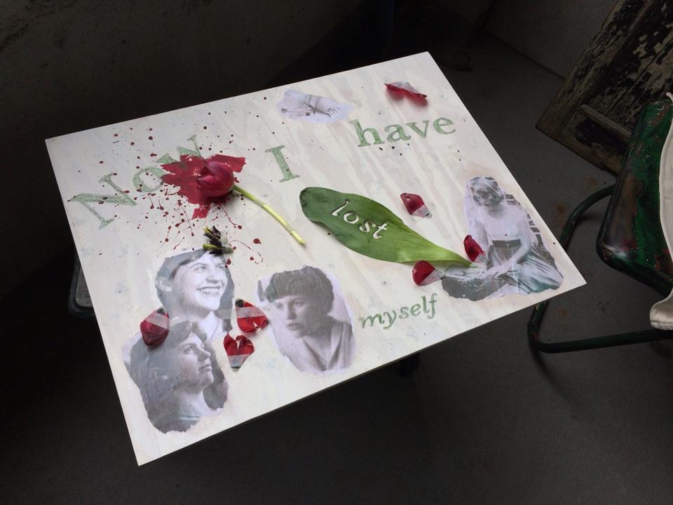 As a student of Poetry at Columbia College Chicago I was in an Introduction to Poetry course. One of the last assignments of the Spring 2014 semester was to do an “artistic translation” of a poem of our choice; as in create a piece, using any medium, based on a specific poem. For this assignment I chose to interpret Sylvia Plath’s “Tulips.” If you wish to read the poem follow this
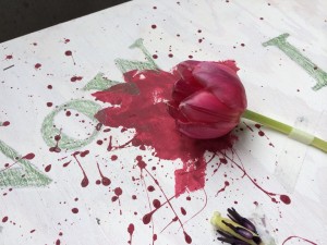
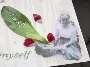
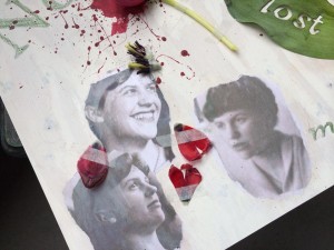 Everything else was completely random and spur of the moment. When thinking of ideas for the piece I had considered using typography in some way to relate back to my major, which is graphic design, but I had forgotten about that until I had secured the tulip. I went back and began reading the poem. The first bit that jumped out at me was “Now I have lost myself” (Plath line 17). I didn’t even use the entire line. I just felt taken with the idea of the speaker losing themselves and I thought it captured the emotions of my piece. So I typed those words into an Illustrator file at different point sizes and styles; I used the Baskerville typeface. Then I printed it out, transferred it to a sheet of tracing paper, and transferred it onto the wood and the leaf. As I was setting the type in Illustrator I thought it would be a beautiful idea to cut one of the words into the leaf; so I did. I chose “lost” because it was a short word, and therefore wouldn’t be too tedious to cut out, and also because it was near the end of the line. This was important because the leaf was going to be on the bottom right of the board and I wanted the line to read correctly from left to right. I absolutely loved the results of that.